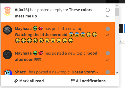
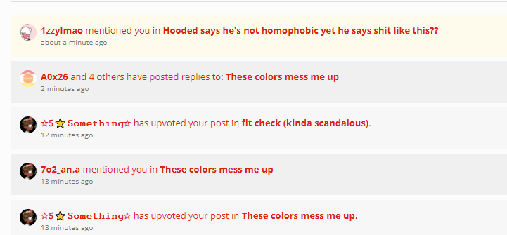
These colors mess me up
-
Look at the slight color difference making a “pattern.” Maybe it’s a light mode thing (so I guess it’s a me problem). I know it’s supposed to look nice, but it messes me up thinking the different colors are unread when it’s not. Which light mode fixes this? I don’t feel like testing them all lol

-
Light mode?

-
@Duchess Ever so slightly, I think it does that for dark theme as well - just checked too, although it might just be my eyes, I’m not sure, haha.
I think it’s just like that. I haven’t tried all of them either. -
Over here it is even worse

-
Galaxy mode?

-
maybe
-
@Burd I knew I’d get this comment
-
Shazz_ I think I’ll have to test them.
-
This looks disgusting
-
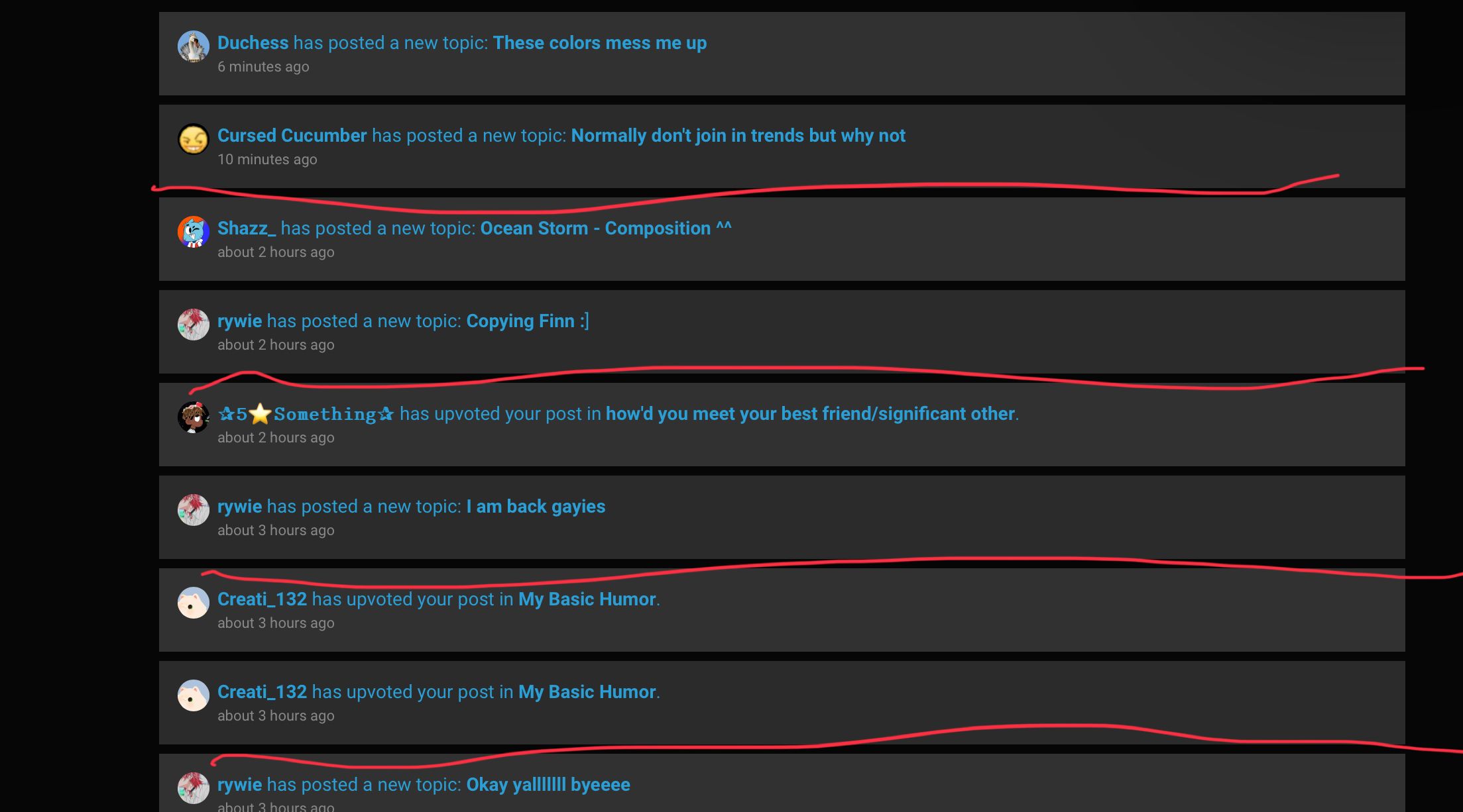
-
@Burger Yeah, that’s annoying.
-
@Duchess
I thought you were saying Mayhas posts are disgusting😭 -
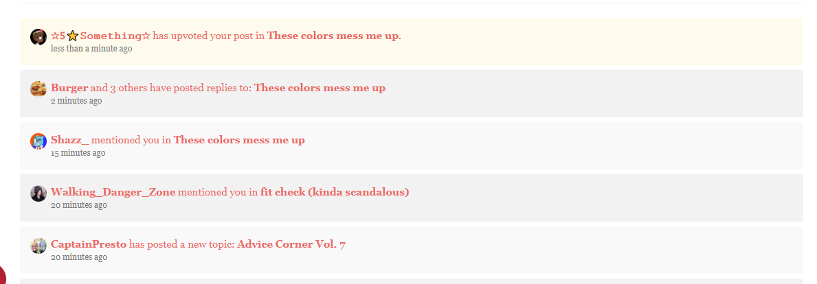
This one looks fine I guess. The yellow is more noticeable -
@7o2_an-a XD Sorry…
-
This won’t due either. This is “Paper”

-
Time to change those colors to go well with my “galaxy theme”
-
@A0x26 If I knew how.
-
This has green text
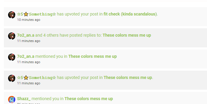
-

-
If anyone likes red, this is Simplex

 ◞ 🎶 If words fail, music speaks! 🎶