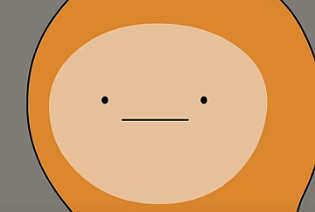
YouTube's New Official Artist Icon :)
-
Toast i- THIS HAPPENED WHILE U WERE HERE
-
@PopTart_Yeeter like i said i no pay attention
-
-
@Wubbrle-the-Wubble Since I upload original music to Spotify, Tunecore (the music distributor I use) adds a special icon to my name through their service :)
-
Toast I was reassigned admin almost a month ago

-
Shazz_ oooooh
anyway i got something cuz idk
When someone tells a joke and ur typing: OMG HAHAHA I’M DYINGGGG HAHHAHA ROLFROFFFROLFROLFROLFROLF LMAOOOOO LMFAOOO IM SCREAMING LITERALLY ROLLING ON THE GROUND ROLFROLFROLFROLFROLFORLF
People behind the screen:

-
@Wubbrle-the-Wubble the whole site is cracking up, bud

-
@PopTart_Yeeter I think it’s turning a Magenta actually - and yeahh I’ve been noticing it too
-
This post is deleted! -
Shazz_ nah i want red to stay

-
Shazz_ yeah
-
@PopTart_Yeeter same
-
Shazz_ yk it surprises me you got THAT
 MUCCH VIEWS on one video
 -
@Wubbrle-the-Wubble shazz put some hard work in lmfao
-
@Wubbrle-the-Wubble Yeahh! I’m happy about that video hahaa and my other piano dubs I’ve done
-
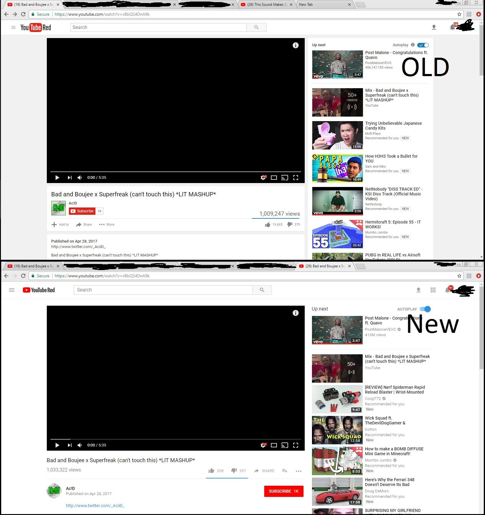
I still prefer the old pre August 29 2017 Youtube layout and stuff. Was in my opinion the best design. The icon looks silly and it just seems like Youtube is shifting from a video-sharing site to a short-video platform like TikTok or Vine before it.
Edit: For context, here’s an image of the pre 29.8 layout and post 29.8 layout.

-
@tea-and-crumpets true
-
@tea-and-crumpets omg u can see alot of changes
-
I like this one compared to the old ones, it actually makes me look at it.

 ◞ 🎶 If words fail, music speaks! 🎶